Ottogi Social Media Food Lettering
Hand lettering and food illustration graphics to promote two ramen products for Ottogi on Instagram and Facebook.
Client: Ottogi
Services: Custom hand lettering and illustration, art direction, social media content
Agency: Skoop Marketing
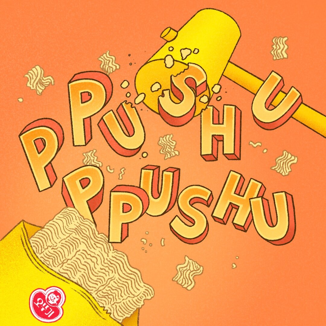
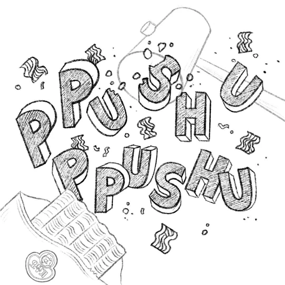
The lettering styles were drawn to mimic the unique quality of each product. Jin ramen has a delicious aroma so the lettering phrase illustrates that. Ppushu Ppushu means “to smash” in Korean and is eaten as a dry snack, so the words were to drawn to appear to be smashed. The color schemes are inspired by each product packaging design.
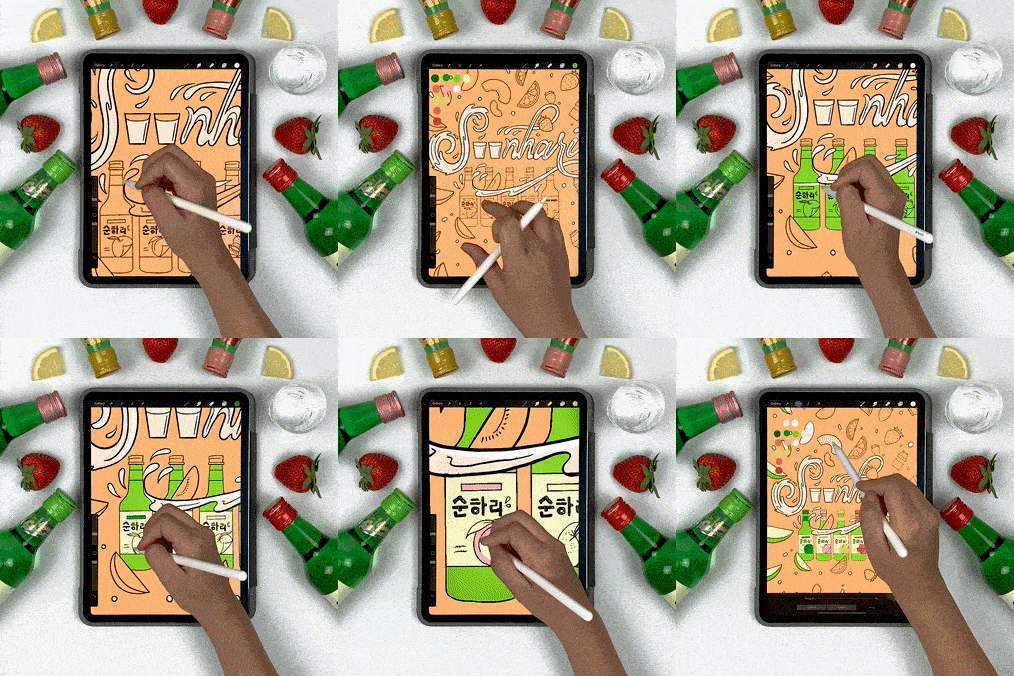
Initial sketches for each image to show how the lettering and the product will be integrated.
