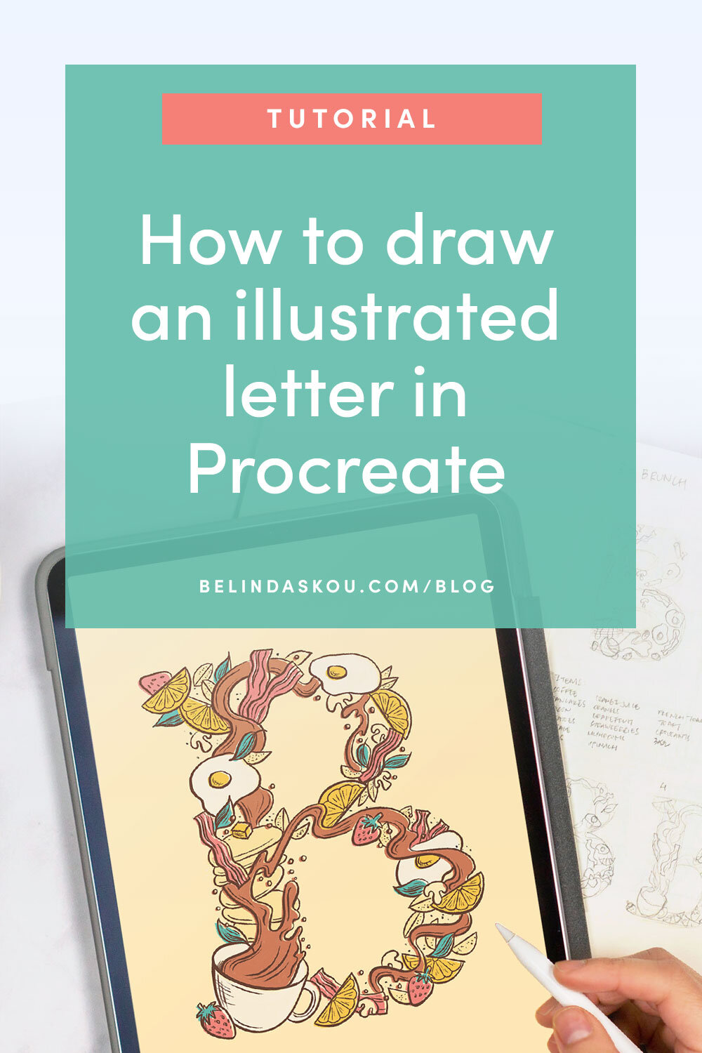
How to draw an illustrated letter in Procreate
If you’ve been looking to draw some interesting, illustration packed letters, this tutorial is for you! It’s a great way to have fun with it and work on some illustration skills. Plus, the process might be simpler than you think!
What’s cool about illustrated letters besides how they look? They can be useful for:
Custom gifts and personal commissions
Drop caps in storybooks
Book cover designs
Engaging typography and lettering-driven posters
36 days of type
And more!

In this tutorial, I break how to create an illustrated letter into 7 simple steps:

Step 1: Brainstorm concept
Pick a theme for your lettering. What kind of illustrations do you want to include? How will they relate to each other? Is it different types of flowers? Your favorite foods? Popular imagery from a story?
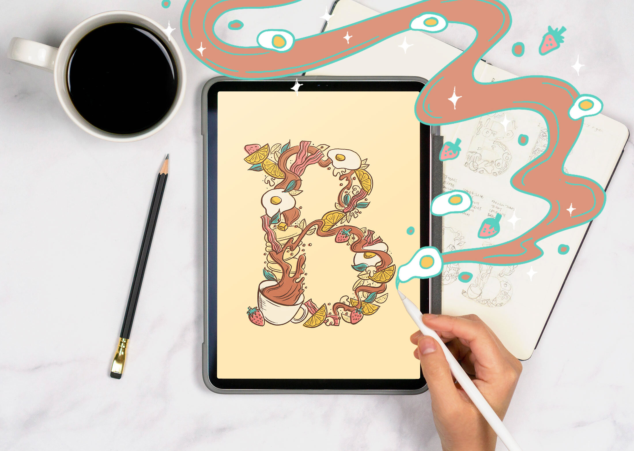
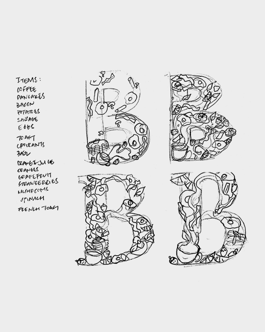
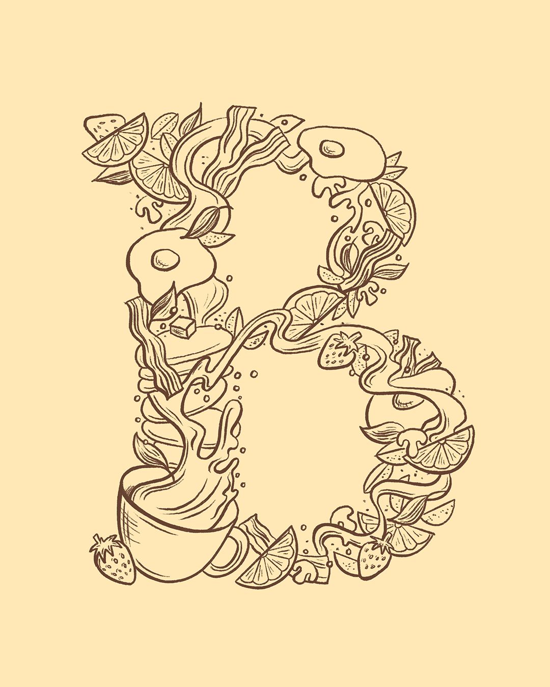
Once you choose your theme, write out a list of what items in that theme you can draw. For example, I picked “brunch” as my theme and listed items like coffee, pancakes, bacon, eggs…now I’m getting hungry…
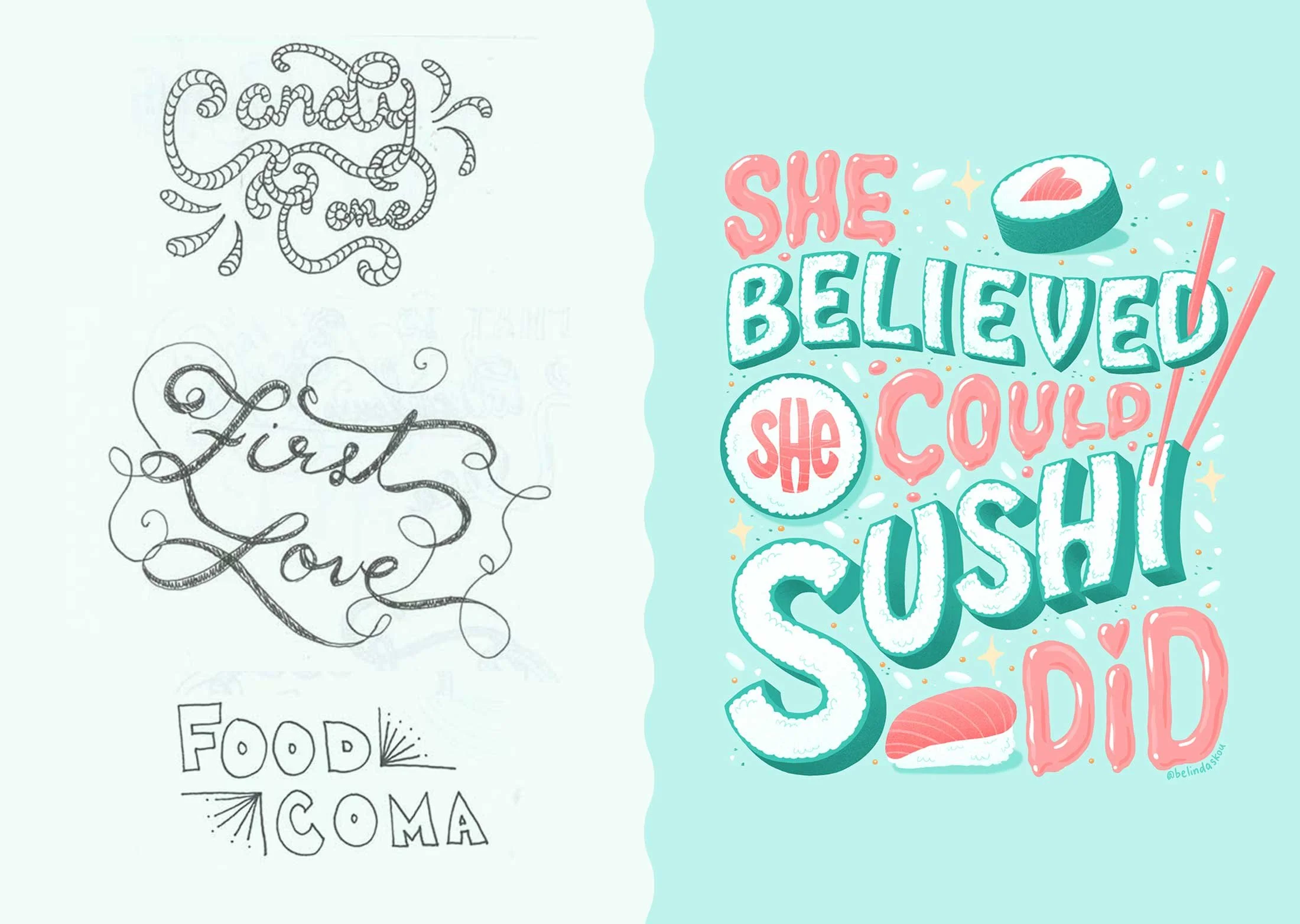
Then, make quick thumbnail sketches. I like to keep this phase analog and sketch quickly in a sketchbook. I find it easier to get the ideas out rather than in Procreate. Real pencil sketches tend to be more forgiving than digital sketches (which tempt me to want to perfect immediately, aka time waster).
One big tip I’d encourage you to do is to avoid falling in love with your first sketch! Aim for at least 3–5 sketches. Doing this can challenge you to push your idea to something better.
When drawing your additional sketches, try to stretch the variety as much as you can before you choose the one you want to go with.
For example, you can try variations like:
Different lettering styles — should it be sans serif, serif, script, or something a bit more abstract? Maybe one style works better for your concept.
Play with scale of objects — will your letter look better with larger objects or tiny ones, a variety of sizes or uniform sizes? Should there be varying shapes or does it look better if they’re all the same shape?
Negative space — do you want your letter to be solidly filled with illustrations, or do you want to illustrate around the letter to create a cool negative space effect?

Step 2: Move into digital sketching
Pick the best idea to refine digitally. Try to choose the idea that not only looks amazing and gets you excited to execute, but also has a solid concept.
You can set your art board to any size — if you plan to print your artwork, set your art board to the largest print size (ex. I often set mine at 8” x 10” at 300dpi or higher).
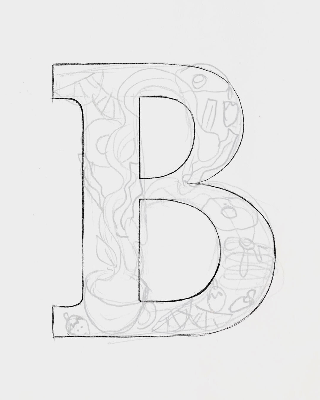
Once you are sketching in Procreate, take the time to perfect your letterform here. You don’t want to build off a letter that isn’t finalized! When in doubt, reference fonts for accuracy.
In the sketching phase, my go-to Procreate brush is the 6b pencil brush.
Pro tip: take a photo of your sketch, bring it into your Procreate canvas, and draw on a separate layer above it! I often redraw on several layers until I get everything the way I want it to look.
Step 3: Fill in with loose illustrations
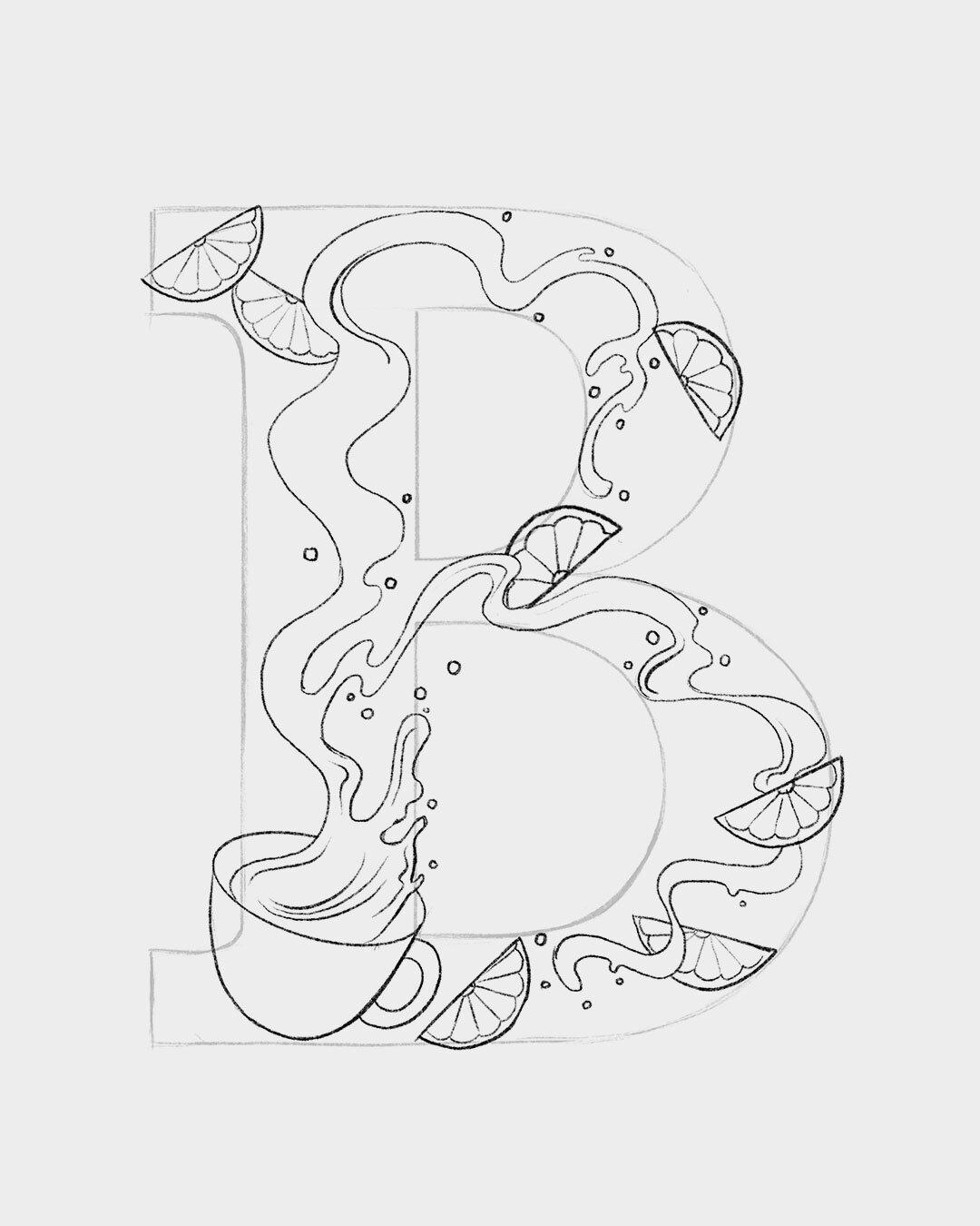
In Procreate, turn down the opacity of the letterform layer to use as your guide.
Start filling in the space with illustrations, placing different objects.
It helps to work with one type of object at a time so you can see how you are distributing everything. You can add a focal point, too (like the coffee in this example).
Pro tip: this is still a sketch phase, so you don’t need to be perfect with your illustrations just yet. You are just figuring out how you want to fill up your letter for it to look uniform as a whole.
Step 4: Lock down line work
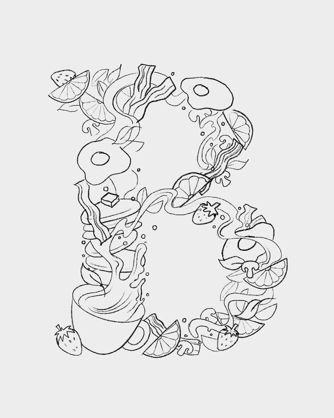
Turn off the letterform outline and voila! Looks good? Keep going! Weird spaces or dense areas? Fix those now.
An easy way to quickly gauge if your illustration is evenly distributed and balanced is to zoom out so you are looking at a tiny thumbnail of your letter. You’ll be able to spot the gaps and dense spots more easily.
Pro tip: little simple objects like bubbles, dots, and sparkles (if it makes sense with your concept) help fill in random gaps.
Step 5: Quickly color block
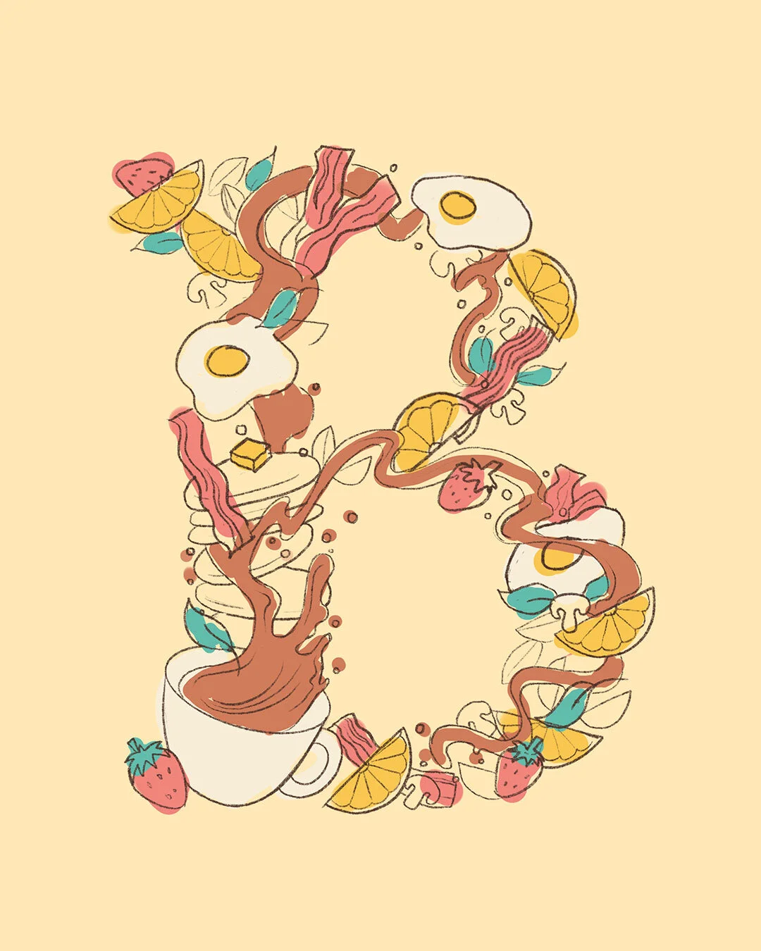
Make a new layer in Procreate. Figure out your color palette and quickly scribble in where you think your colors will go. Then, check for even color distribution.
If something looks too dense in the colors, make your adjustments now. This is also a good time to check for contrast in your colors and save yourself the trouble of making a billion iterations later. 😉
Pro tip: Does something seem off with your color choices? Try switching to grayscale. This will help you to see the contrast between your colors. Find the areas that seem too close and change your color saturation levels to make them different.
Color can be a big struggle and pain sometimes! If you’re feeling stuck, I wrote an article to help you color your lettering with ease. Read my tutorial on Lettering Daily here.
Step 6: Refine line work
Now for the fun part! Turn down the opacity of your sketch layer (I turn it down to 10% or under).
Make a new layer on top. Start drawing over the layer, fine tuning lines and adding in extra details. This is where you start perfecting your illustrations.
I’m using the 6B pencil brush for this example. I also like to use the studio pen and syrup brushes. Both are included in Procreate (under Sketching and Inking).
Step 7: Add color
Make a new layer for each color below the line work layer. Start painting in colors!
Keep each of your colors on their own layers just in case you change your mind about color palettes later (you can change the colors by alpha locking the layer and filling it with a new color). Plus, it can be fun to come up with several different color ways for your final letter!
Turn off your reference layer and then you’re done! Take a step back and admire your final piece. And maybe grab a snack. You might be hungry. 😋

What next?
If you want to challenge yourself, you can try to create an entire alphabet based on the theme of your original letter. Otherwise, you can use this exercise when you don’t know what else to draw.
Plus, you’ll have these fun, ready-to-print letters that you can use to create awesome products or gift to others…the possibilities are endless!
Grab your free cheat sheet
Did you get your copy of my Procreate Shortcuts Sampler yet? Join my newsletter and get my 10 favorite shortcuts to speed up your digital art workflow here!
Did you find this useful? Pin me to bookmark this tutorial! ⤵