How to spice up your lettering with illustrations
I once had my husband try a Chinese noodle dish I made (I’m not a fan of cooking). After a few bites he looked up and said, “Something’s missing. It needs more spice!” (What can I say, I married him for his honesty 😆)
Ever look at your lettering that way? You stare at it and feel that something’s missing.
Maybe your lettering seems to you like my somewhat bland noodles (which I’ve perfected since then 😉).
Illustrative elements could be the secret sauce that transforms your lettering from flavorless to flavorful🌶.
It helps to create movement, interest, and chances to sneak in fun visual “easter eggs.” Even better, it can reduce the number of times you look at your work and think “something’s missing.”
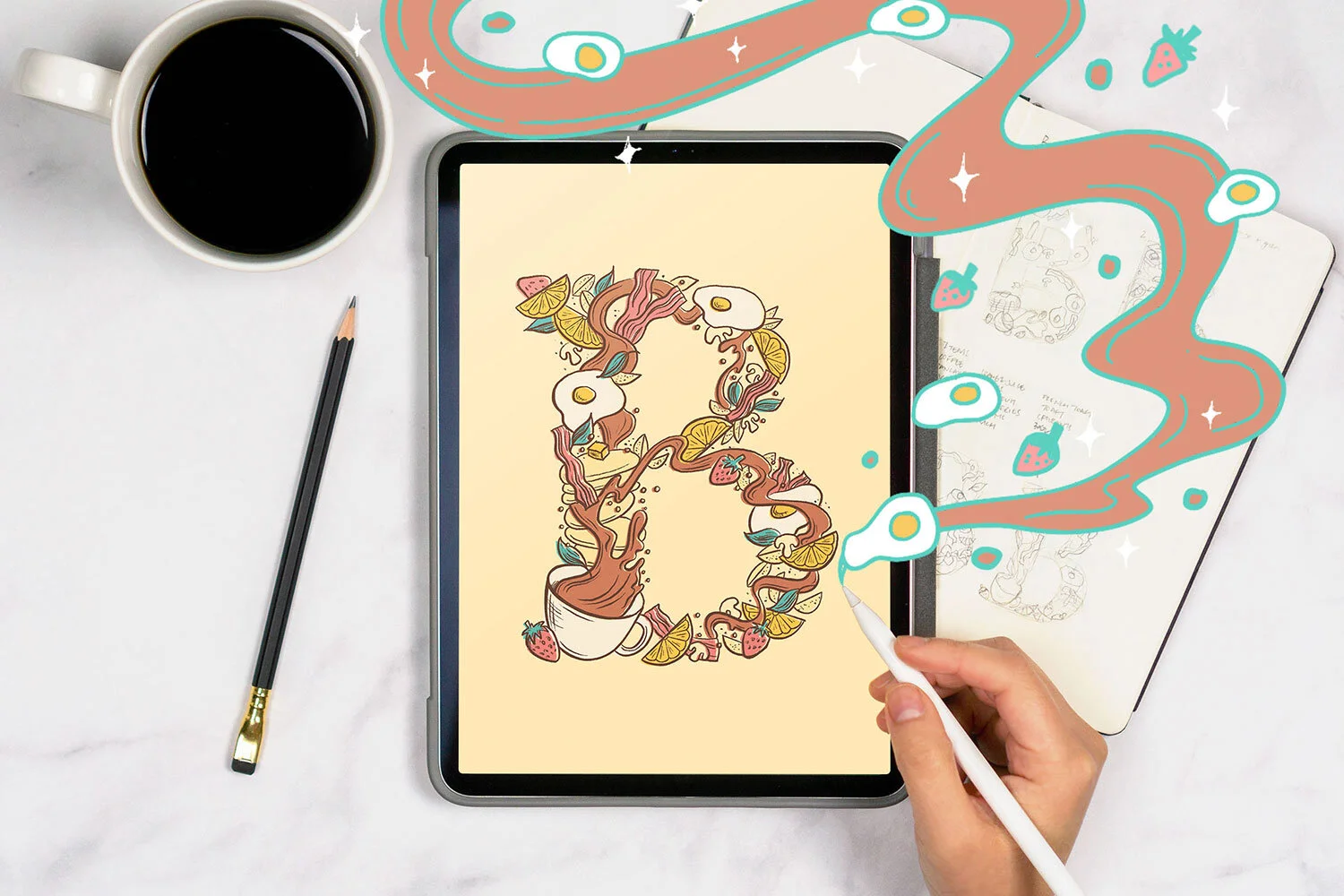
I had the pleasure of sharing my process for adding illustrative elements to lettering compositions in Procreate with Design Cuts. You can watch the video of this tutorial here:
Below is the written step-by-step process for how to spice up your lettering with illustrations.
Hint: for best results, start at the very beginning of the sketch phase. 😊
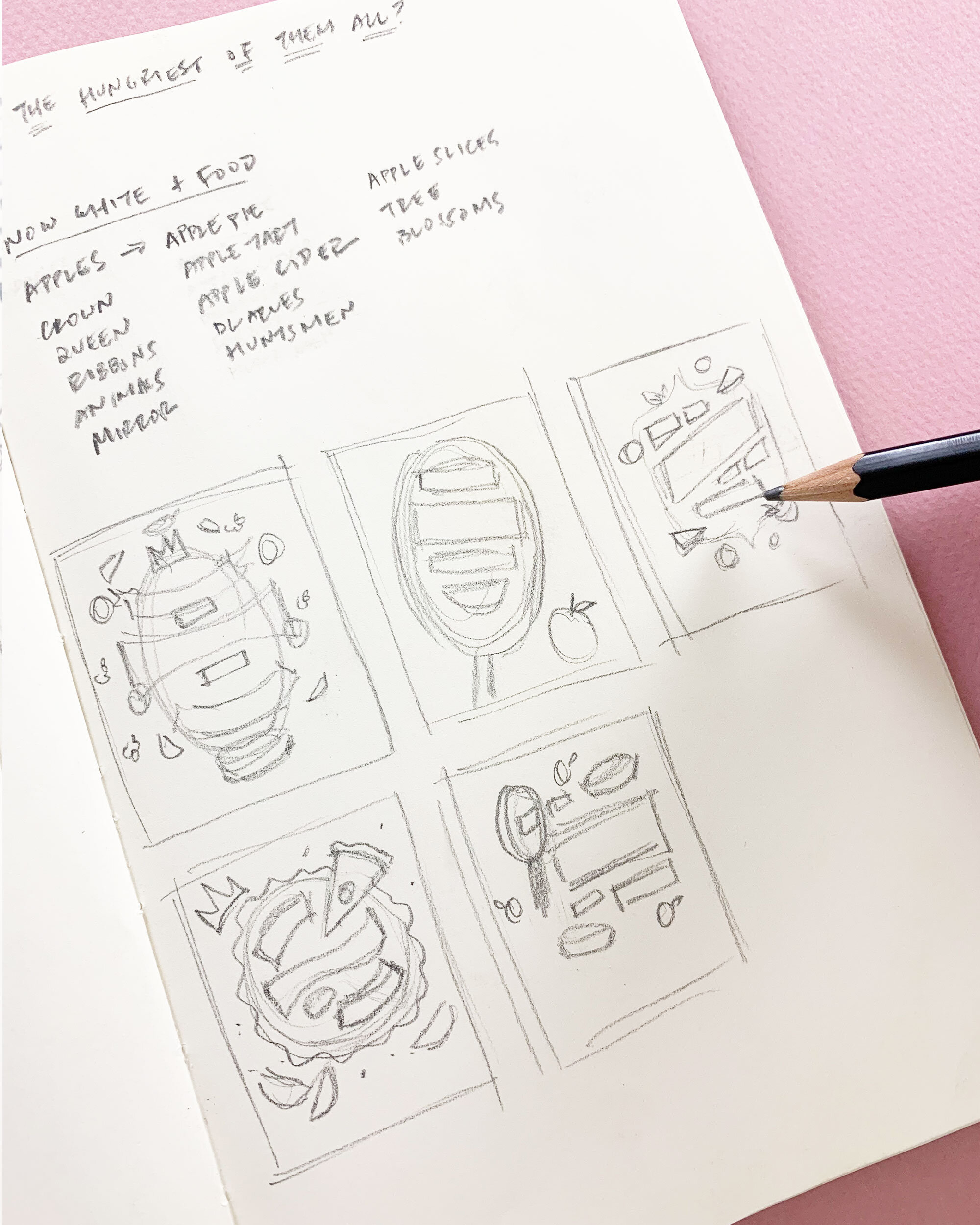
Step 1: Brainstorm concept

First, grab a sketchbook (or a piece of paper) and pencil. In this part of the process, your goal is to get your ideas out of your head and onto something you can see.
I like starting with analog tools rather than digital to get messy without worrying about perfection (that comes later!).
Write out the phrase
Once you decide on the phrase you’ll be lettering, write it out.
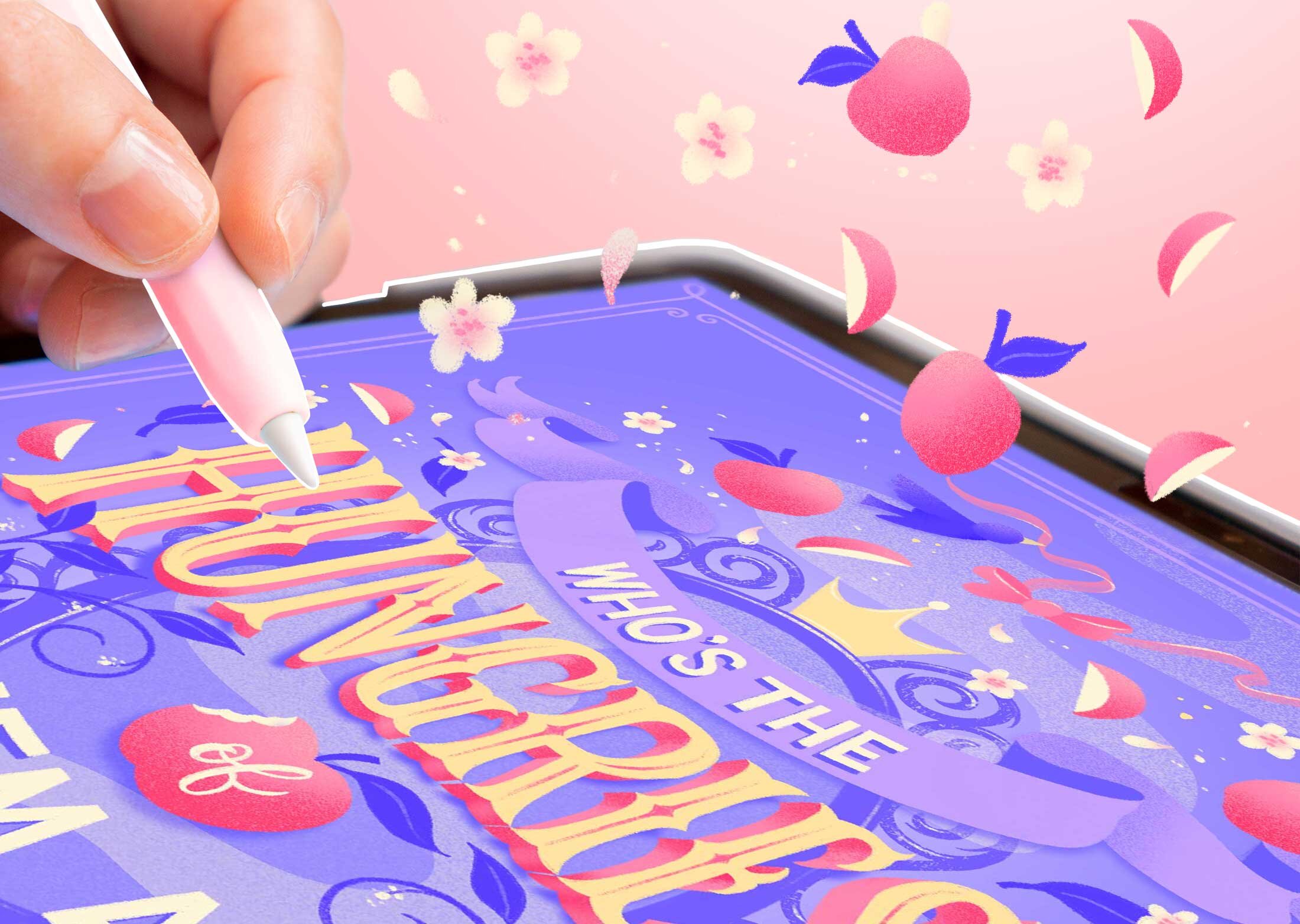
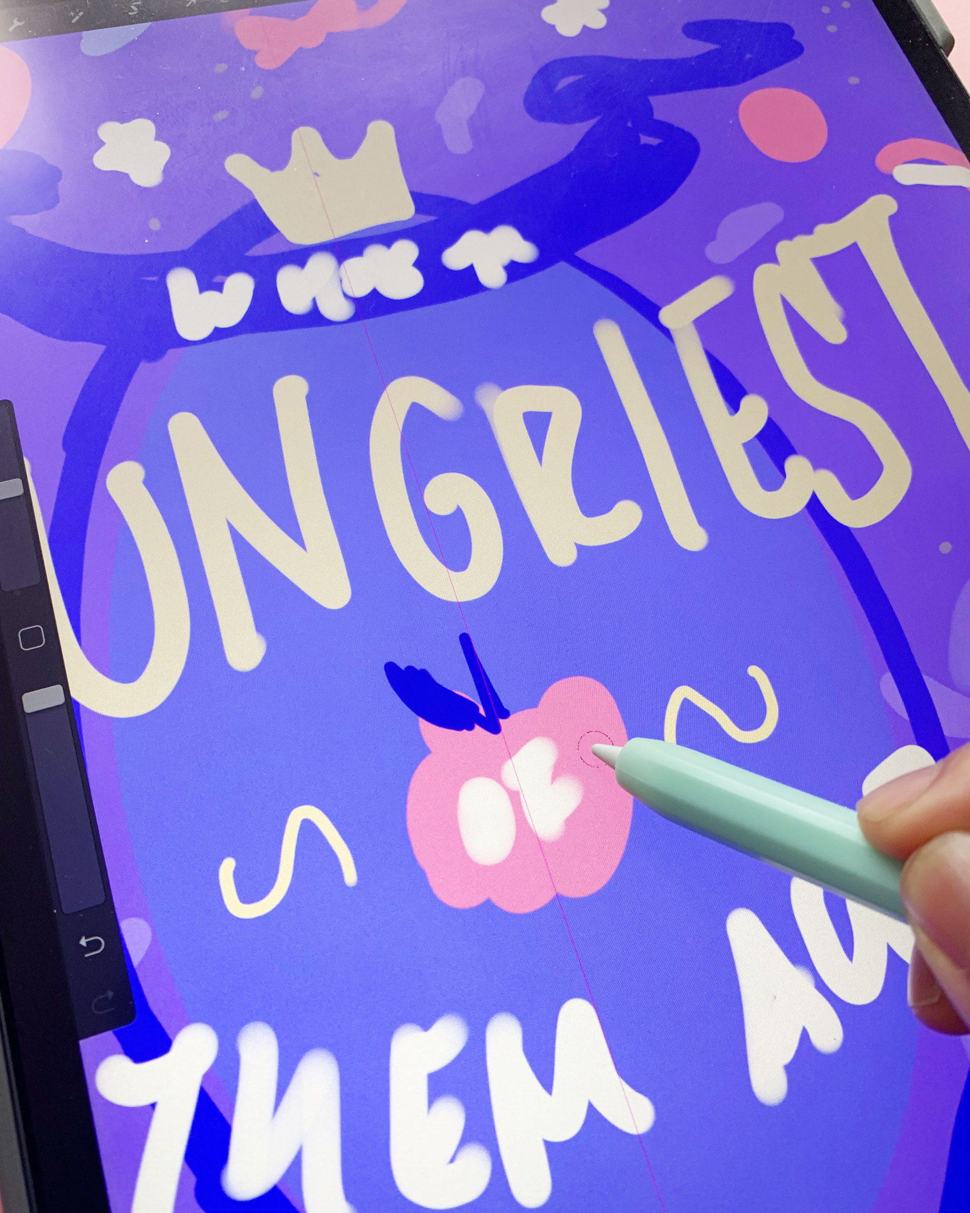
I’ll be using “Who’s the hungriest of them all?” from my project Hungrily Ever After, fairy tales with a foodie twist, as our example phrase for this tutorial.
Write down illustration ideas
Ever throw in a few random sparkles, squiggles or flowers to fill up space when you’re almost done with your drawing? I have, and it didn’t always make sense 😆.
Brainstorming how to integrate your illustrations at the very beginning gives you the chance to enhance the story of your lettering through the illustrations that you add.
Looking at your phrase, what images come to mind? (ex. crown, apples, apple pie, mirror for Snow White with a foodie twist)
Write them allll down (no filtering yet!).
Once you’ve made your list, put a star next to the ones that you’d like to work into your layout.

Draw rough thumbnail sketches
Draw 3–5 rough thumbnail sketches to warm up your creative muscles without worrying about perfecting.
Sketch lettering layout
Looking at your phrase, what are the most important parts of the message? Underline them. These are your primary words.
Then, put a double underline for your secondary words, triple for your tertiary, and so on. This is a way to figure out the type hierarchy of your phrase. You’ll usually need around 2-4 levels, depending on how long your phrase is.
Ready to put your phrase into a composition? 🤩
Start with small, messy sketches about the size of your thumbnail. This’ll help you to see the big picture of your composition. Again, no perfecting yet!
Pro tip: Use boxes to help with composition
Sketch with boxes instead of words and simple shapes to get a sense of composition and balance before losing time in the details. This is a great trick if you’re feeling a little scared about creating a complex layout. Sketch the actual letters back in once you feel good about your box arrangement.
Once you get your boxes in, you can play with things like scale, weight, or lettering style to make a word stand out based on where it is in priority.
Sketch in illustrations
Refer back to your list of illustration ideas and pick some to start roughly sketching in. Use generic shapes (circle, triangle, squares, etc) to show where they’d go so you don’t spend too much time with details.
Here are some ideas for how to add illustrations:
Put a word into an illustration (ex. “Of” is a small word that I placed into an “apple”)
Put the entire phrase into an illustration (ex. What if “Who’s the hungriest of them all?” is in the shape of a giant pie or mirror)
Fill up space around shorter words
Step 2: Refine one sketch

Looking at your 3-5 ideas, pick the one that’s the strongest to you (or that you’re most excited to do) to refine in Procreate!
Set up canvas in Procreate
You can set your art board to any size — if you plan to print your artwork, set your art board to the largest print size (I often set mine at 8” x 10” at 300dpi or higher)
Create your digital sketch
On a new layer, sketch out your lettering composition digitally.
6B pencil brush is my go-to brush for this step.
Start to refine your lettering and illustrations as you go, so you have an idea of how to lay down your final illustrations and what your lettering styles will look like.
Pro tip: Take a photo to Fight the blank canvas fear
Take a photo of your thumbnail sketch, bring it into Procreate, and scale up to the canvas size! Then turn down the opacity of that layer. I’ve found that this helps combat “blank canvas fear” and gives you a starting point digitally. (Watch this 15-second video tutorial for how to do this)

Refine in layers
This part happens in layers (literally!). Once you like where your rough digital sketch is, turn the opacity of that down. This will serve as your reference for where to place your letters and illustrations as you refine.
On a new layer, start refining your lettering.
At this stage you can use the layers in Procreate similarly to how you’d use tracing paper. You trace once, turn the opacity down, and layer on top to make a cleaner trace. Then turn off the old layer. Then keep repeating that process until you get a final lettering that you’re happy with.
It’s okay if this part takes a long time!
This is the longest part of the process for me. Take a break, eat a snack, and get back to it when you’re ready to keep going. 😉
For complex lettering, this is also when I start setting down grids and guides.
I often use the Grid Builder brush set to speed up the workflow. I keep these guides on the same layer so I can turn the opacity of the guide layer when I draw my final lettering on top. They’re also in pink so I remember that they’re guides!
Step 3: Add color and details
Quickly color block
If you ever get stuck choosing colors for your art, one trick is to do a color comp before you get too far into refining!
Make a new layer in Procreate. Figure out your color palette and quickly scribble in blobs of color. Notice how messy mine is.
Then, check for even color distribution and contrast.
Still struggling with color? Here’s an article of tips I wrote on Lettering Daily to help!

Add color and illustrations
Once you have your color comp down, use it as a reference to start applying color to your refined sketch.
This is where you can add more flavor to your lettering like dimension, shading, and decorative elements to give it more interest.
Keep in mind what your phrase is about and how you choose the decorative elements for your letters. For example, in this piece, I combined modern with vintage lettering styles to represent the mix of food and fairy tales. So, I decided to add some dimension, spurs, and inlines to the letters.
Step 4: Add finishing touches

A pinch of decorative elements here, a dash of texture there. This is the fun part!
Season to (your artistic) taste. 😉
The texture brushes I use in this piece are Procreate’s noise brush, Shoutbam’s Rough and Raw set, and Gouache Shader brushers.
You’re done!
Enjoy your finished art piece. 😍


You can even mock it up into some fun book covers! Here’s the template I used for these.
Watch the video tutorial
If you’d like to see a live demonstration of the process behind this foodie Snow White piece from my Hungrily Ever After series, you can watch this replay of my live stream with the wonderful Design Cuts community.
Did you find this useful? Pin me to bookmark this tutorial! ⤵

Hungry for more resources?
Check out more digital lettering tutorials below!