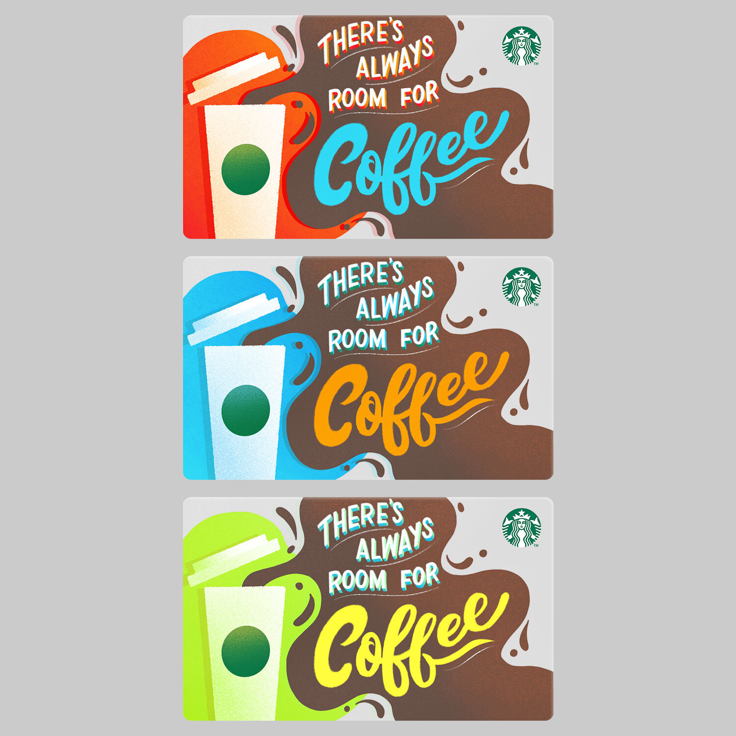
Starbucks Gift Card
Gift card concept for Starbucks that featuring coffee illustration and playful hand lettering. This one plays off the phrase, "There's always room for dessert." I can’t always make room for dessert but I can definitely make room for coffee (with a particular weakness for a good cup of Starbucks coffee, or a soy flat white for those special days).
Sketched out six concepts in layout to factor in the placement of the Starbucks logo. Chose the last one based on readability, movement, and a little whimsy. Adjusted “coffee" lettering to script to emulate the movement of the coffee spill. The thicker shapes would also provide opportunity for vibrant blocks of color to stand out at gift card size, and the coffee spill could be a clever way to cover up the bar strip that's on the back since that part of the area will be clear.
Color concepts. The final one was chosen based on its level of contrast to help the card stand out on a shelf.


