Julie Andrews Podcast Artwork
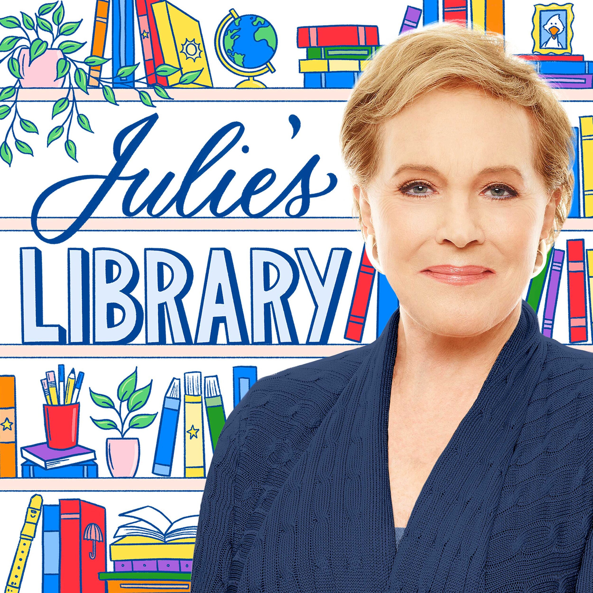
Digital hand lettering and illustration for a new kids podcast, Julie’s Library, launched by Julie Andrews and American Public Media. With the first week of its release, the podcast was #1 in the Kids & Family category and #15 overall in Apple podcasts.
Client: Julie Andrews
Art Direction: Minnesota Public Radio
Services: Custom hand lettering and illustration
“Belinda was collaborative, thoughtful and responsive throughout the process — which involved quite a few stakeholders (including Julie Andrews herself) — and we were all very happy with the final design. We’re looking forward to working with her again.”
After some initial design explorations, Minnesota Public Radio commissioned me to create the podcast artwork for Julie’s Library for a more custom, hand-drawn look for the main title and illustration behind Julie Andrews.
Their target audience was was kids ages 5–8 and busy household parents, with librarians and teachers as their secondary audience. Julie Andrews and her daughter wanted to use the podcast as a way to instill a lifelong love of books for children, and their initial direction to convey a tone of sweet, classic, charming, familiar, and welcoming.
Two initial concept sketches were presented: one which focused more the “classic” aspect of the podcast, featuring a hand drawn illustration of book shelves behind Julie Andrews to play up the library imagery. The second concept plays up the excitement that comes with reading books, utilizing script lettering and flying book illustrations to create movement and energy.
Both concepts include a star motif that alludes to the stars that are in the Julie Andrews Collection logo.
This sketch features the revised version of the selected concept, which includes adding more elements to the shelves for a whimsical, fun feel and additional “easter eggs” of some of Julie Andrews’ other work. (ex. such as Hugo the duck, and items that can be referenced in the stories that will be featured in the podcast.)
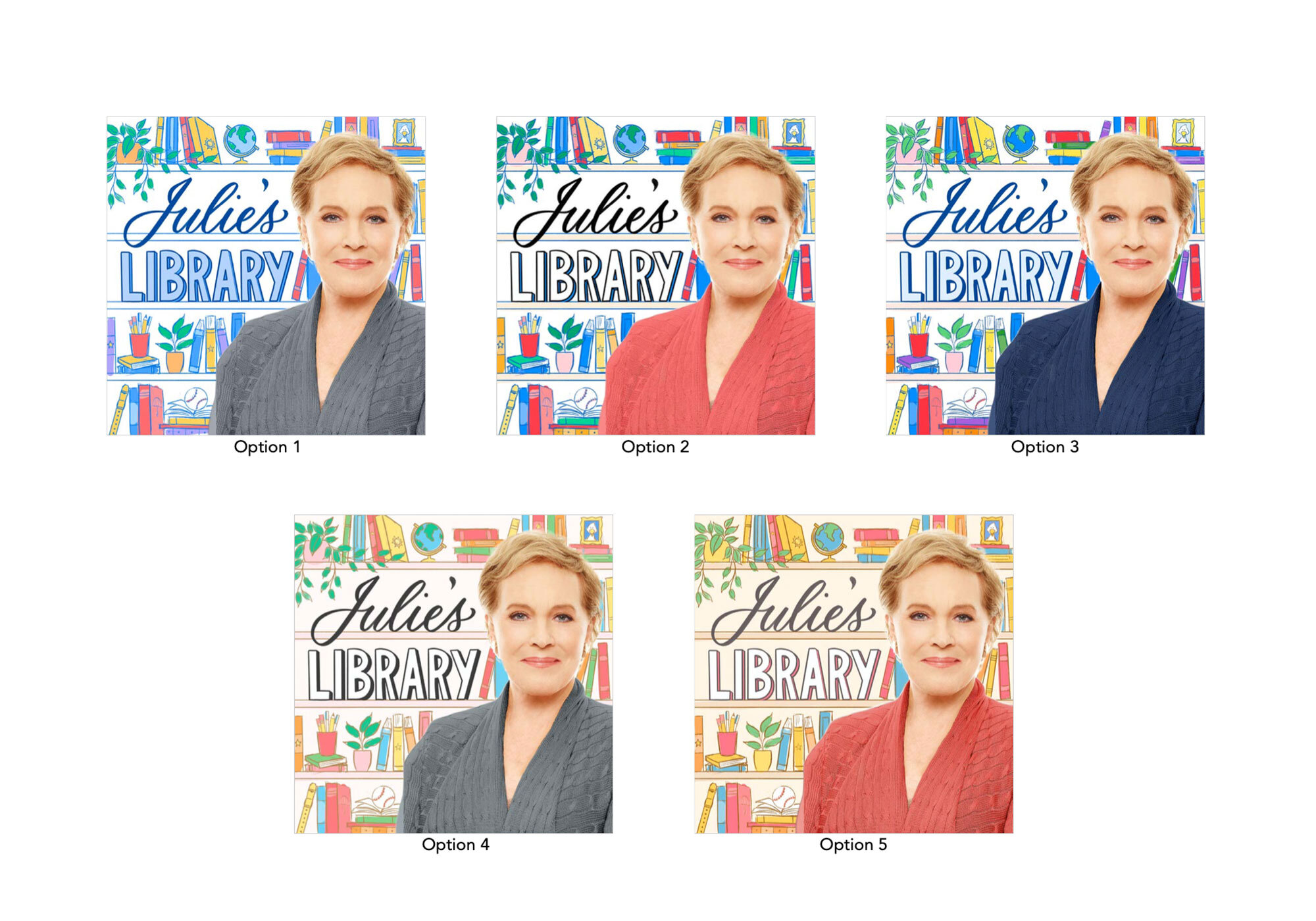
Above are color explorations. Originally moving in the direction of a more muted, softer palette, the team ultimately chose option three for its contrast and brightness.
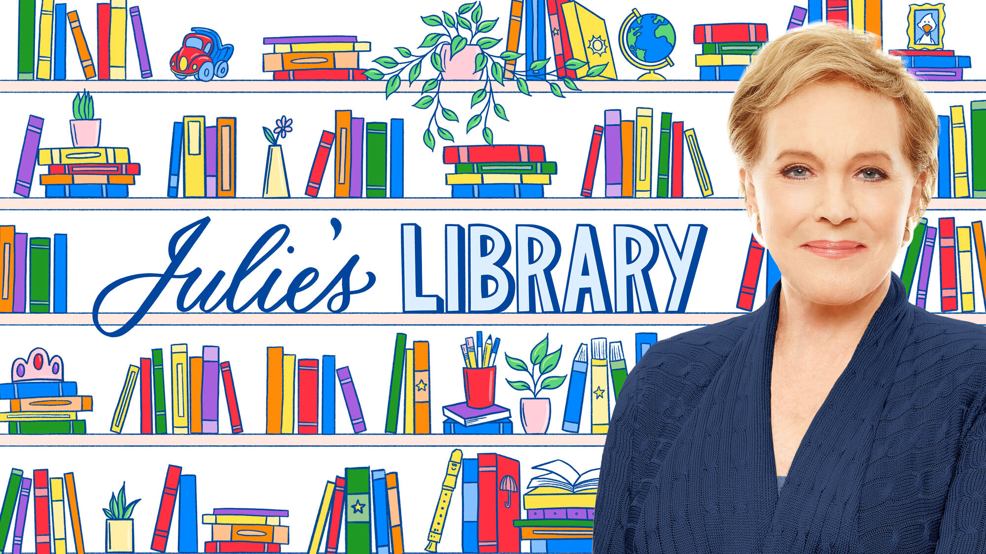
Artwork was finalized with a few size variations created to serve across multiple online platforms.


